Plotting in R Part V - Date Axis

In this tutorial we will look at the some tips to work with date (date and time).
Working with time stamp scale is different from let say a continuous or discrete scale.

The data source link.


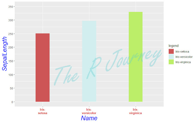
Lets look at the basic plot


# Load libraries
library(ggplot2)

# The set your working directory
setwd("C:/R_Train") # please replace with your own directory


# read the data into a dataframe
tbl <- read.csv("Sample Data/temp.csv")

# convert time stamp
tbl$Time_Stamp <- as.POSIXct(tbl$Time_Stamp, format="%m/%d/%Y %H:%M")

# basic plot
ggplot(tbl, aes(x=Time_Stamp, y=Area)) + 
  geom_line(size = .5, color = "blue") + geom_point(size = 1, color = "darkgreen") +
  theme(panel.grid.major.x = element_line(color="chocolate4"), 
        panel.grid.minor.x = element_line(color = "cyan4")) +
  theme(panel.background = element_rect(fill = 'bisque2', colour = 'black')) +
  theme(plot.background = element_rect(fill = 'aquamarine3', colour = 'coral4')) +
  theme(axis.title.x = element_text(size = 25, color = "navajowhite4", face = "bold"))+
  theme(axis.title.y = element_text(size = 25, color = "navajowhite4", face = "bold")) +
  theme(axis.text.x = element_text(size = 15))+
  theme(axis.text.y = element_text(size = 15)) +
  theme(plot.margin = unit(c(0, 0, 20, 20), "pt"))


Now let see how to set the x scale. Let say major axis every hour.

Code

ggplot(tbl, aes(x=Time_Stamp, y=Area)) + 
  geom_line(size = .5, color = "blue") + geom_point(size = 1, color = "darkgreen") +
  theme(panel.grid.major.x = element_line(color="chocolate4"), 
        panel.grid.minor.x = element_line(color = "cyan4")) +
  theme(panel.background = element_rect(fill = 'bisque2', colour = 'black')) +
  theme(plot.background = element_rect(fill = 'aquamarine3', colour = 'coral4')) +
  theme(axis.title.x = element_text(size = 25, color = "navajowhite4", face = "bold"))+
  theme(axis.title.y = element_text(size = 25, color = "navajowhite4", face = "bold")) +
  theme(axis.text.x = element_text(size = 15))+
  theme(axis.text.y = element_text(size = 15)) +
  theme(plot.margin = unit(c(0, 0, 20, 20), "pt")) +
  scale_x_datetime(breaks = "hour")

Output


As you can see the overlapping of x axis text (label). We can fix it by changing angle.

Code

ggplot(tbl, aes(x=Time_Stamp, y=Area)) + 
  geom_line(size = .5, color = "blue") + geom_point(size = 1, color = "darkgreen") +
  theme(panel.grid.major.x = element_line(color="chocolate4"), 
        panel.grid.minor.x = element_line(color = "cyan4")) +
  theme(panel.background = element_rect(fill = 'bisque2', colour = 'black')) +
  theme(plot.background = element_rect(fill = 'aquamarine3', colour = 'coral4')) +
  theme(axis.title.x = element_text(size = 25, color = "navajowhite4", face = "bold"))+
  theme(axis.title.y = element_text(size = 25, color = "navajowhite4", face = "bold")) +
  theme(axis.text.x = element_text(size = 15))+
  theme(axis.text.y = element_text(size = 15)) +
  theme(plot.margin = unit(c(0, 0, 20, 20), "pt")) +
  scale_x_datetime(breaks = "hour") + 
  theme(axis.text.x = element_text(size = 6,angle = 90))

Output


It is possible to change the scale in different scales, for example every 4 hours.

Code

ggplot(tbl, aes(x=Time_Stamp, y=Area)) + 
  geom_line(size = .5, color = "blue") + geom_point(size = 1, color = "darkgreen") +
  theme(panel.grid.major.x = element_line(color="chocolate4"), 
        panel.grid.minor.x = element_line(color = "cyan4")) +
  theme(panel.background = element_rect(fill = 'bisque2', colour = 'black')) +
  theme(plot.background = element_rect(fill = 'aquamarine3', colour = 'coral4')) +
  theme(axis.title.x = element_text(size = 25, color = "navajowhite4", face = "bold"))+
  theme(axis.title.y = element_text(size = 25, color = "navajowhite4", face = "bold")) +
  theme(axis.text.x = element_text(size = 15))+
  theme(axis.text.y = element_text(size = 15)) +
  theme(plot.margin = unit(c(0, 0, 20, 20), "pt")) +
  scale_x_datetime(breaks = "4 hour")
  theme(axis.text.x = element_text(size = 10,angle = 90))

Output


But if you still need the hourly x scale. You can do with minor breaks.

Code

ggplot(tbl, aes(x=Time_Stamp, y=Area)) + 
  geom_line(size = .5, color = "blue") + geom_point(size = 1, color = "darkgreen") +
  theme(panel.grid.major.x = element_line(color="chocolate4"), 
        panel.grid.minor.x = element_line(color = "cyan4")) +
  theme(panel.background = element_rect(fill = 'bisque2', colour = 'black')) +
  theme(plot.background = element_rect(fill = 'aquamarine3', colour = 'coral4')) +
  theme(axis.title.x = element_text(size = 25, color = "navajowhite4", face = "bold"))+
  theme(axis.title.y = element_text(size = 25, color = "navajowhite4", face = "bold")) +
  theme(axis.text.x = element_text(size = 15))+
  theme(axis.text.y = element_text(size = 15)) +
  theme(plot.margin = unit(c(0, 0, 20, 20), "pt")) +
  scale_x_datetime(breaks = "4 hour", minor_breaks = "1 hours")
  theme(axis.text.x = element_text(size = 10,angle = 90))

Output


That is the end of Part V of Plotting In R. 

If you have any specific request configuring ggplot2, please leave a comment. 
I will try to add to in the current posts or cover that in future posts.


Plotting in R Part IV - Plotting Margins

In Part I, I have discussed about the basic plot and axis modification/enhancement
In Part II, I have discussed about grid line modification/enhancement
In Part III, I have discussed about panel/plot background modification/enhancement

In this section we will discus how to change the panel and plot area margins.

Recap:

The libraries and data set needed. 
Library: ggplot2, stringr
Dataset: iris (to be loaded from local drive)
IDE: RStudio

# First load the library
library(ggplot2)

library(stringr)
library(ggpubr)
library(jpeg)

# The set your working directory
setwd("C:/R_Train") # please replace with your own directory

# Read the file and create a data frame
tbl <- read.csv("Sample Data/iris.csv")


Get the csv file  from here.
data source 

  • Modify the plot margins
    • Change the top margins
The original image 


    • Change the right margins
Code
ggplot(tbl, aes(x=Name, y=SepalLength, fill = Name)) + 
  geom_bar(stat="identity", width = 0.3) +
  theme(axis.title.x = element_text(size = 20, color = "blue", face = "italic")) +
  theme(axis.text.x = element_text(size = 10, color = "firebrick3", face = "bold")) +
  scale_x_discrete(labels = function(x) str_wrap(x, width = 10)) + 
  theme(axis.title.y = element_text(size = 20, color = "blue", face = "italic")) +
  scale_y_continuous(limits = c(0,350), breaks = seq(0,350,50)) +
  scale_fill_manual("legend", values = c("Iris-setosa"  = "indianred3", "Iris-versicolor" = "lightcyan4", "Iris-virginica" = "darkolivegreen4")) +
  theme(panel.grid = element_blank()) +
  theme(plot.background = element_rect(fill = 'aquamarine3', colour = 'coral4')) + 
  theme(plot.margin = unit(c(0, 50, 0, 0), "pt"))

Output


    • Change the bottom margins
Code
ggplot(tbl, aes(x=Name, y=SepalLength, fill = Name)) + 
  geom_bar(stat="identity", width = 0.3) +
  theme(axis.title.x = element_text(size = 20, color = "blue", face = "italic")) +
  theme(axis.text.x = element_text(size = 10, color = "firebrick3", face = "bold")) +
  scale_x_discrete(labels = function(x) str_wrap(x, width = 10)) + 
  theme(axis.title.y = element_text(size = 20, color = "blue", face = "italic")) +
  scale_y_continuous(limits = c(0,350), breaks = seq(0,350,50)) +
  scale_fill_manual("legend", values = c("Iris-setosa"  = "indianred3", "Iris-versicolor" = "lightcyan4", "Iris-virginica" = "darkolivegreen4")) +
  theme(panel.grid = element_blank()) +
  theme(plot.background = element_rect(fill = 'aquamarine3', colour = 'coral4')) + 
  theme(plot.margin = unit(c(0, 0, 50, 0), "pt"))

Output


    • Change the bottom margins
Code

ggplot(tbl, aes(x=Name, y=SepalLength, fill = Name)) + 
  geom_bar(stat="identity", width = 0.3) +
  theme(axis.title.x = element_text(size = 20, color = "blue", face = "italic")) +
  theme(axis.text.x = element_text(size = 10, color = "firebrick3", face = "bold")) +
  scale_x_discrete(labels = function(x) str_wrap(x, width = 10)) + 
  theme(axis.title.y = element_text(size = 20, color = "blue", face = "italic")) +
  scale_y_continuous(limits = c(0,350), breaks = seq(0,350,50)) +
  scale_fill_manual("legend", values = c("Iris-setosa"  = "indianred3", "Iris-versicolor" = "lightcyan4", "Iris-virginica" = "darkolivegreen4")) +
  theme(panel.grid = element_blank()) +
  theme(plot.background = element_rect(fill = 'aquamarine3', colour = 'coral4')) + 
  theme(plot.margin = unit(c(0, 0, 0, 50), "pt"))

Output


    • All together

Code

ggplot(tbl, aes(x=Name, y=SepalLength, fill = Name)) + 
  geom_bar(stat="identity", width = 0.3) +
  theme(axis.title.x = element_text(size = 20, color = "blue", face = "italic")) +
  theme(axis.text.x = element_text(size = 10, color = "firebrick3", face = "bold")) +
  scale_x_discrete(labels = function(x) str_wrap(x, width = 10)) + 
  theme(axis.title.y = element_text(size = 20, color = "blue", face = "italic")) +
  scale_y_continuous(limits = c(0,350), breaks = seq(0,350,50)) +
  scale_fill_manual("legend", values = c("Iris-setosa"  = "indianred3", "Iris-versicolor" = "lightcyan4", "Iris-virginica" = "darkolivegreen4")) +
  theme(panel.grid = element_blank()) +
  theme(plot.background = element_rect(fill = 'aquamarine3', colour = 'coral4')) + 
  theme(plot.margin = unit(c(50, 50, 50, 50), "pt"))

Output


 theme(plot.margin = unit(c(top, right, bottom, left), "pt"))

That is the end of Part IV of Plotting In R. 

If you have any specific request configuring ggplot2, please leave a comment. 
I will try to add to in the current posts or cover that in future posts.


Plotting in R Part III - Background

In Part I, I have discussed about the basic plot and axis modification/enhancement
In Part II, I have discussed about grid line modification/enhancement

Recap:

The libraries and data set needed. 
Library: ggplot2, stringr
Dataset: iris (to be loaded from local drive)
IDE: RStudio

# First load the library
library(ggplot2)

library(stringr)
library(ggpubr)
library(jpeg)

# The set your working directory
setwd("C:/R_Train") # please replace with your own directory

# Read the file and create a data frame
tbl <- read.csv("Sample Data/iris.csv")


Get the csv file  from here.
data source 


Modify the Backgrounds
  • Modify the panel background

Code
ggplot(tbl, aes(x=Name, y=SepalLength, fill = Name)) + 
  geom_bar(stat="identity", width = 0.3) +
  theme(axis.title.x = element_text(size = 20, color = "blue", face = "italic")) +
  theme(axis.text.x = element_text(size = 10, color = "firebrick3", face = "bold")) +
  scale_x_discrete(labels = function(x) str_wrap(x, width = 10)) + 
  theme(axis.title.y = element_text(size = 20, color = "blue", face = "italic")) +
  scale_y_continuous(limits = c(0,350), breaks = seq(0,350,50)) +
  scale_fill_manual("legend", values = c("Iris-setosa"  = "indianred3", "Iris-versicolor" = "lightcyan4", "Iris-virginica" = "darkolivegreen4")) +
  theme(panel.grid = element_blank()) +
  theme(panel.background = element_rect(fill = 'bisque2', colour = 'black'))


fill = 'bisque2' - as it says its the fill color
colour = 'black' - this is the border color


Output


  • Modify the plot background
Code
ggplot(tbl, aes(x=Name, y=SepalLength, fill = Name)) + 
  geom_bar(stat="identity", width = 0.3) +
  theme(axis.title.x = element_text(size = 20, color = "blue", face = "italic")) +
  theme(axis.text.x = element_text(size = 10, color = "firebrick3", face = "bold")) +
  scale_x_discrete(labels = function(x) str_wrap(x, width = 10)) + 
  theme(axis.title.y = element_text(size = 20, color = "blue", face = "italic")) +
  scale_y_continuous(limits = c(0,350), breaks = seq(0,350,50)) +
  scale_fill_manual("legend", values = c("Iris-setosa"  = "indianred3", "Iris-versicolor" = "lightcyan4", "Iris-virginica" = "darkolivegreen4")) +
  theme(panel.grid = element_blank()) +
  theme(panel.background = element_rect(fill = 'bisque2', colour = 'black')) +
  theme(plot.background = element_rect(fill = 'aquamarine3', colour = 'coral4'))

fill = 'aquamarine3'as it says its the fill color
colour = 'coral4' this is the border color

Output


  • Add image as background
To do this you need to install packages ggpubr, jpeg

For this tutorial purposes I have created a image.


Code
# load image
img <- readJPEG("Posts/ggplot3/backgg.jpg")

ggplot(tbl, aes(x=Name, y=SepalLength, fill = Name)) + 
  background_image(img) +
  geom_bar(stat="identity", width = 0.3) +
  theme(axis.title.x = element_text(size = 20, color = "blue", face = "italic")) +
  theme(axis.text.x = element_text(size = 10, color = "firebrick3", face = "bold")) +
  scale_x_discrete(labels = function(x) str_wrap(x, width = 10)) + 
  theme(axis.title.y = element_text(size = 20, color = "blue", face = "italic")) +
  scale_y_continuous(limits = c(0,350), breaks = seq(0,350,50)) +
  scale_fill_manual("legend", values = c("Iris-setosa"  = "indianred3", "Iris-versicolor" = "lightcyan4", "Iris-virginica" = "darkolivegreen4")) +
  theme(panel.grid = element_blank()) +
  theme(plot.background = element_rect(fill = 'aquamarine3', colour = 'coral4'))

Please note the image is added before box plot is plotted in the code.

Output


That is the end of part III of Plotting In R. 

If you have any specific request configuring ggplot2, please leave a comment. I will try to add to in the current posts or cover that in future posts.


Plotting in R Part II - Grid Lines

We will start from end of Part I.

Recap:

The libraries and data set needed. 
Library: ggplot2, stringr
Dataset: iris (to be loaded from local drive)
IDE: RStudio

# First load the library
library(ggplot2)

# The set your working directory
setwd("C:/R_Train") # please replace with your own directory

# Read the file and create a data frame
tbl <- read.csv("Sample Data/iris.csv")


Get the csv file  from here.
data source 


Modify the grid lines

The grid can be modified individually using panel.grid.major.x,   panel.grid.major.y,  panel.grid.minor.x and panel.grid.minor.y.


  • change the color of the major grid of y axis.

Code
ggplot(tbl, aes(x=Name, y=SepalLength, fill = Name)) + 
  geom_bar(stat="identity", width = 0.3) +
  theme(axis.title.x = element_text(size = 20, color = "blue", face = "italic")) +
  theme(axis.text.x = element_text(size = 10, color = "firebrick3", face = "bold")) +
  scale_x_discrete(labels = function(x) str_wrap(x, width = 10)) + 
  theme(axis.title.y = element_text(size = 20, color = "blue", face = "italic")) +
  scale_y_continuous(limits = c(0,350), breaks = seq(0,350,50)) +
  scale_fill_manual("legend", values = c("Iris-setosa"  = "indianred3", "Iris-versicolor" = "lightcyan2", "Iris-virginica" = "darkolivegreen2")) +
  theme(panel.grid.major.y = element_line(colour = "black"))

Output

  • Change the color of the minor grid of y axis.

Code

ggplot(tbl, aes(x=Name, y=SepalLength, fill = Name)) + 
  geom_bar(stat="identity", width = 0.3) +
  theme(axis.title.x = element_text(size = 20, color = "blue", face = "italic")) +
  theme(axis.text.x = element_text(size = 10, color = "firebrick3", face = "bold")) +
  scale_x_discrete(labels = function(x) str_wrap(x, width = 10)) + 
  theme(axis.title.y = element_text(size = 20, color = "blue", face = "italic")) +
  scale_y_continuous(limits = c(0,350), breaks = seq(0,350,50)) +
  scale_fill_manual("legend", values = c("Iris-setosa"  = "indianred3", "Iris-versicolor" = "lightcyan2", "Iris-virginica" = "darkolivegreen2")) +
  theme(panel.grid.major.y = element_line(colour = "black"), panel.grid.minor.y = element_line(colour = "blue"))

Output


  • Change the color of the grid of x axis
Code
ggplot(tbl, aes(x=Name, y=SepalLength, fill = Name)) + 
  geom_bar(stat="identity", width = 0.3) +

  theme(axis.title.x = element_text(size = 20, color = "blue", face = "italic")) +
  theme(axis.text.x = element_text(size = 10, color = "firebrick3", face = "bold")) +
  scale_x_discrete(labels = function(x) str_wrap(x, width = 10)) + 
  theme(axis.title.y = element_text(size = 20, color = "blue", face = "italic")) +
  scale_y_continuous(limits = c(0,350), breaks = seq(0,350,50)) +
  scale_fill_manual("legend", values = c("Iris-setosa"  = "indianred3", "Iris-versicolor" = "lightcyan2", "Iris-virginica" = "darkolivegreen2")) +
  theme(panel.grid.major.y = element_line(colour = "black"), panel.grid.minor.y = element_line(colour = "blue")) +
  theme(panel.grid.major.x = element_line(colour = "black"))


Output


  • Change major grids color at once.

Code

ggplot(tbl, aes(x=Name, y=SepalLength, fill = Name)) + 
  geom_bar(stat="identity", width = 0.3) +
  theme(axis.title.x = element_text(size = 20, color = "blue", face = "italic")) +
  theme(axis.text.x = element_text(size = 10, color = "firebrick3", face = "bold")) +
  scale_x_discrete(labels = function(x) str_wrap(x, width = 10)) + 
  theme(axis.title.y = element_text(size = 20, color = "blue", face = "italic")) +
  scale_y_continuous(limits = c(0,350), breaks = seq(0,350,50)) +
  scale_fill_manual("legend", values = c("Iris-setosa"  = "indianred3", "Iris-versicolor" = "lightcyan2", "Iris-virginica" = "darkolivegreen2")) +
  theme(panel.grid.major = element_line(colour = "black"))

Output
  • Change all the grids at once

Code
ggplot(tbl, aes(x=Name, y=SepalLength, fill = Name)) + 
  geom_bar(stat="identity", width = 0.3) +
  theme(axis.title.x = element_text(size = 20, color = "blue", face = "italic")) +
  theme(axis.text.x = element_text(size = 10, color = "firebrick3", face = "bold")) +
  scale_x_discrete(labels = function(x) str_wrap(x, width = 10)) + 
  theme(axis.title.y = element_text(size = 20, color = "blue", face = "italic")) +
  scale_y_continuous(limits = c(0,350), breaks = seq(0,350,50)) +
  scale_fill_manual("legend", values = c("Iris-setosa"  = "indianred3", "Iris-versicolor" = "lightcyan2", "Iris-virginica" = "darkolivegreen2")) +
  theme(panel.grid = element_line(colour = "black"))


Output


But in some cases you don't want the grid lines. 

  • remove x grid lines
Code
ggplot(tbl, aes(x=Name, y=SepalLength, fill = Name)) + 
  geom_bar(stat="identity", width = 0.3) +
  theme(axis.title.x = element_text(size = 20, color = "blue", face = "italic")) +
  theme(axis.text.x = element_text(size = 10, color = "firebrick3", face = "bold")) +
  scale_x_discrete(labels = function(x) str_wrap(x, width = 10)) + 
  theme(axis.title.y = element_text(size = 20, color = "blue", face = "italic")) +
  scale_y_continuous(limits = c(0,350), breaks = seq(0,350,50)) +
  scale_fill_manual("legend", values = c("Iris-setosa"  = "indianred3", "Iris-versicolor" = "lightcyan2", "Iris-virginica" = "darkolivegreen2")) +
  theme(panel.grid.major.x = element_blank())


Output


  • remove the y minor grid lines
Code

ggplot(tbl, aes(x=Name, y=SepalLength, fill = Name)) + 
  geom_bar(stat="identity", width = 0.3) +
  theme(axis.title.x = element_text(size = 20, color = "blue", face = "italic")) +
  theme(axis.text.x = element_text(size = 10, color = "firebrick3", face = "bold")) +
  scale_x_discrete(labels = function(x) str_wrap(x, width = 10)) + 
  theme(axis.title.y = element_text(size = 20, color = "blue", face = "italic")) +
  scale_y_continuous(limits = c(0,350), breaks = seq(0,350,50)) +
  scale_fill_manual("legend", values = c("Iris-setosa"  = "indianred3", "Iris-versicolor" = "lightcyan2", "Iris-virginica" = "darkolivegreen2")) +
  theme(panel.grid.major.x = element_blank(), panel.grid.minor.y = element_blank())

Output


  • remove all the grid lines
Code
ggplot(tbl, aes(x=Name, y=SepalLength, fill = Name)) + 
  geom_bar(stat="identity", width = 0.3) +
  theme(axis.title.x = element_text(size = 20, color = "blue", face = "italic")) +
  theme(axis.text.x = element_text(size = 10, color = "firebrick3", face = "bold")) +
  scale_x_discrete(labels = function(x) str_wrap(x, width = 10)) + 
  theme(axis.title.y = element_text(size = 20, color = "blue", face = "italic")) +
  scale_y_continuous(limits = c(0,350), breaks = seq(0,350,50)) +
  scale_fill_manual("legend", values = c("Iris-setosa"  = "indianred3", "Iris-versicolor" = "lightcyan2", "Iris-virginica" = "darkolivegreen2")) +
  theme(panel.grid = element_blank())

Output


That is the end of part 2 of Plotting In R. 

If you have any specific request configuring ggplot2, please leave a comment. I will try to add to in the current posts or cover that in future posts. 


Plotting in R Part I - Axis


One of the strong points of R is plotting. It is possible to make highly presentable plots with the help of ggplot2 library. There are many plots available in ggplot2. The aim of this tutorial series more on configuring the different aspects of a plot, like background, grid, axis, title, border and so on. We will se how to make a simple plot and make it into nice looking plot.

The libraries and data set needed.
Library: ggplot2, stringr
Dataset: iris (to be loaded from local drive)
IDE: RStudio

# First load the library
library(ggplot2)

# The set your working directory
setwd("C:/R_Train") # please replace with your own directory

# Read the file and create a data frame
tbl <- read.csv("Sample Data/iris.csv")


Get the csv file  from here.
data source 

For this tutorial Bar chart is used to illustrate the modifications/enhancements you can do.

Base plot 

Code

ggplot(tbl, aes(x=Name, y=SepalLength)) +
   geom_bar(stat="identity")


From the documentation “ Sometimes, bar charts are used not as a distributional summary, but instead of a dotplot. Generally, it's preferable to use a dotplot (see geom_point) as it has a better data-ink ratio. However, if you do want to create this type of plot, you can set y to the value you have calculated, and use stat='identity' ”

Output


The graph is basic and nothing fancy about it. Let’s configure or improve the appearance.

Let’s start with x-axis. First modify the Axis title.

  • Increase the Font size

Code

ggplot(tbl, aes(x=Name, y=SepalLength)) +
   geom_bar(stat="identity") +
   theme(axis.title.x = element_text(size = 20))


Output


  • Change font color

Code

ggplot(tbl, aes(x=Name, y=SepalLength)) +
   geom_bar(stat="identity") +
   theme(axis.title.x = element_text(size = 20, color = "blue"))


Output


  • Change font face

Code

ggplot(tbl, aes(x=Name, y=SepalLength)) +
   geom_bar(stat="identity") +
   theme(axis.title.x = element_text(size = 20, color = "blue", face = "italic"))


Output


Modify the axis text.

The element modified here is axis.text.x
Note the difference between axis.title.x and axis.text.x
Change the font size, color and face

Code

ggplot(tbl, aes(x=Name, y=SepalLength)) +
   geom_bar(stat="identity") +
   theme(axis.title.x = element_text(size = 20, color = "blue", face = "italic")) +
   theme(axis.text.x = element_text(size = 10, color = "firebrick3", face = "bold"))


Output


  • Change the angle
If your axis text is long and overlapping each other, its possible to change the angle.

Code

ggplot(tbl, aes(x=Name, y=SepalLength)) +
   geom_bar(stat="identity") +
   theme(axis.title.x = element_text(size = 20, color = "blue", face = "italic")) +
   theme(axis.text.x = element_text(size = 10, color = "firebrick3", face = "bold", angle = 90,    hjust = 0.5))


hjust = 0.5 to keep the text at the center of the bar.

Output


  • Wrap the text

Other option is to wrap the text. For this we need library stringr. Using the function str_wrap to do this wrapping.

Code

ggplot(tbl, aes(x=Name, y=SepalLength)) +
   geom_bar(stat="identity") +
   theme(axis.title.x = element_text(size = 20, color = "blue", face = "italic")) +
   theme(axis.text.x = element_text(size = 10, color = "firebrick3", face = "bold")) +
   scale_x_discrete(labels = function(x) str_wrap(x, width = 10))


Output


All the actions that has been explained above can be done on for axis y. But there is no axis text.


Code

ggplot(tbl, aes(x=Name, y=SepalLength, fill = Name)) +
   geom_bar(stat="identity") +
   theme(axis.title.x = element_text(size = 20, color = "blue", face = "italic")) +
   theme(axis.text.x = element_text(size = 10, color = "firebrick3", face = "bold")) +
   scale_x_discrete(labels = function(x) str_wrap(x, width = 10)) +
   theme(axis.title.y = element_text(size = 20, color = "blue", face = "italic"))

Output


Modify the scale of y axis

It is possible to manually change the scale.

Code

ggplot(tbl, aes(x=Name, y=SepalLength)) +
   geom_bar(stat="identity") +
   theme(axis.title.x = element_text(size = 20, color = "blue", face = "italic")) +
   theme(axis.text.x = element_text(size = 10, color = "firebrick3", face = "bold")) +
   scale_x_discrete(labels = function(x) str_wrap(x, width = 10)) +
   theme(axis.title.y = element_text(size = 20, color = "blue", face = "italic")) +
   scale_y_continuous(limits = c(0,350), breaks = seq(0,350,50))

Output


  • Modify the bars
    • Change the colors


By adding “fill = Name” in aes you can change the colors

Code

ggplot(tbl, aes(x=Name, y=SepalLength, fill = Name)) +
   geom_bar(stat="identity") +
   theme(axis.title.x = element_text(size = 20, color = "blue", face = "italic")) +
   theme(axis.text.x = element_text(size = 10, color = "firebrick3", face = "bold")) +
   scale_x_discrete(labels = function(x) str_wrap(x, width = 10))

Output


The colors are pre-defined, if you want to change the colors as per your choice the need to do a manual override.

To do that you need to now all the categories in x.
Easily done using unique function

unique(tbl$Name)
[1] "Iris-setosa" "Iris-versicolor" "Iris-virginica"


Code

ggplot(tbl, aes(x=Name, y=SepalLength, fill = Name)) +
   geom_bar(stat="identity") +
   theme(axis.title.x = element_text(size = 20, color = "blue", face = "italic")) +
   theme(axis.text.x = element_text(size = 10, color = "firebrick3", face = "bold")) +
   scale_x_discrete(labels = function(x) str_wrap(x, width = 10)) +
   theme(axis.title.y = element_text(size = 20, color = "blue", face = "italic")) +
   scale_fill_manual("legend", values = c("Iris-setosa" = "indianred3", "Iris-versicolor" =    "lightcyan2", "Iris-virginica" = "darkolivegreen2"))

Output


Change the width of the bars It is easily done using width = in Geom_bar

Code

ggplot(tbl, aes(x=Name, y=SepalLength, fill = Name)) +
   geom_bar(stat="identity", width = 0.3) +
   theme(axis.title.x = element_text(size = 20, color = "blue", face = "italic")) +
   theme(axis.text.x = element_text(size = 10, color = "firebrick3", face = "bold")) +
   scale_x_discrete(labels = function(x) str_wrap(x, width = 10)) +
   theme(axis.title.y = element_text(size = 20, color = "blue", face = "italic")) +
   scale_fill_manual("legend", values = c("Iris-setosa" = "indianred3", "Iris-versicolor" = "lightcyan2", "Iris-virginica" = "darkolivegreen2"))

Output


In the next post I will be discussing further configuration/modification/enhancement you can do with ggplot2.


Update I:
The y axis 0 is not starting at x axis. There is a gap.

Code

ggplot(tbl, aes(x=Name, y=SepalLength, fill = Name)) +
   geom_bar(stat="identity", width = 0.3) +
   theme(axis.title.x = element_text(size = 20, color = "blue", face = "italic")) +
   theme(axis.text.x = element_text(size = 10, color = "firebrick3", face = "bold")) +
   scale_x_discrete(labels = function(x) str_wrap(x, width = 10)) +
   theme(axis.title.y = element_text(size = 20, color = "blue", face = "italic")) +
   scale_y_continuous(expand = c(0, 0), limits = c(0,350), breaks = seq(0,350,50)) +
   scale_fill_manual("legend", values = c("Iris-setosa" = "indianred3", "Iris-versicolor" = "lightcyan2", "Iris-virginica" = "darkolivegreen2"))

Output